Nasdaq-100 Information Observatory
A structured information tool for Chinese investors tracking the Nasdaq-100 — focused on index structure, valuation positioning, participation cost, and macro context, rather than scattered financial news.
Designed as a focused market dashboard that helps users answer two core questions: what is happening now, and how should I participate more rationally?
Solo Project — Product Strategy · Information Architecture · UI Design · Front-end Build
The Problem
For many Chinese investors, Nasdaq-100 information is available everywhere but rarely organized in a way that supports actual decision-making. News apps, quote apps, ETF pages, and macro data all exist separately, forcing users to piece together their own view.
Most tools either focus too narrowly on price movement or become too broad like a generic finance portal. The challenge was to design a more focused information product: not a comprehensive market website, but a structured observation interface centered specifically on the Nasdaq-100.
The product needed to reduce noise, clarify the current state of the index, reveal participation cost through domestic ETF products, and place the index inside a larger macro context.
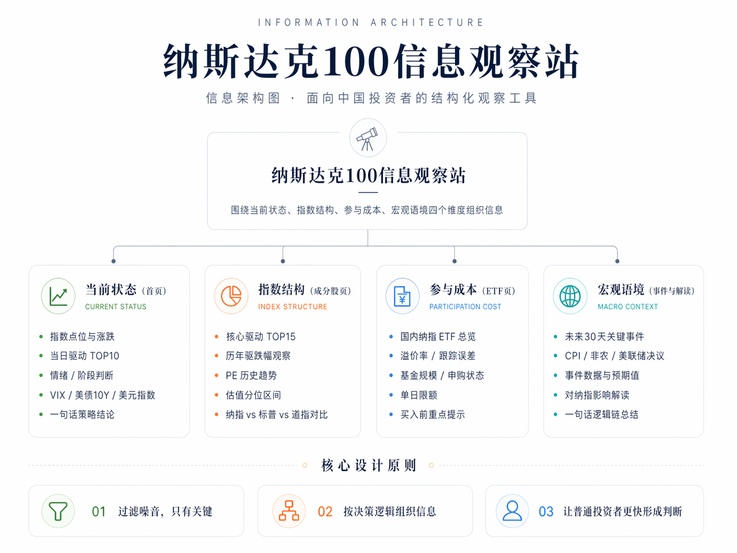
Information Architecture
The information architecture was organized into four dimensions, each answering a different layer of investor concern: current state, index structure, participation cost, and macro context.
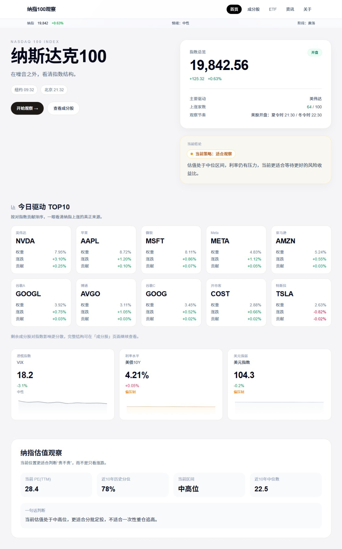
Dimension 1 · Current State (Main Homepage)
A quick overview of the index level, daily change, and key summary signals, helping users understand the current market condition at a glance.
Dimension 2 · Index Structure (Constituents Page)
Weight distribution, constituent behavior, and the internal structure of the index, showing what is actually driving performance.
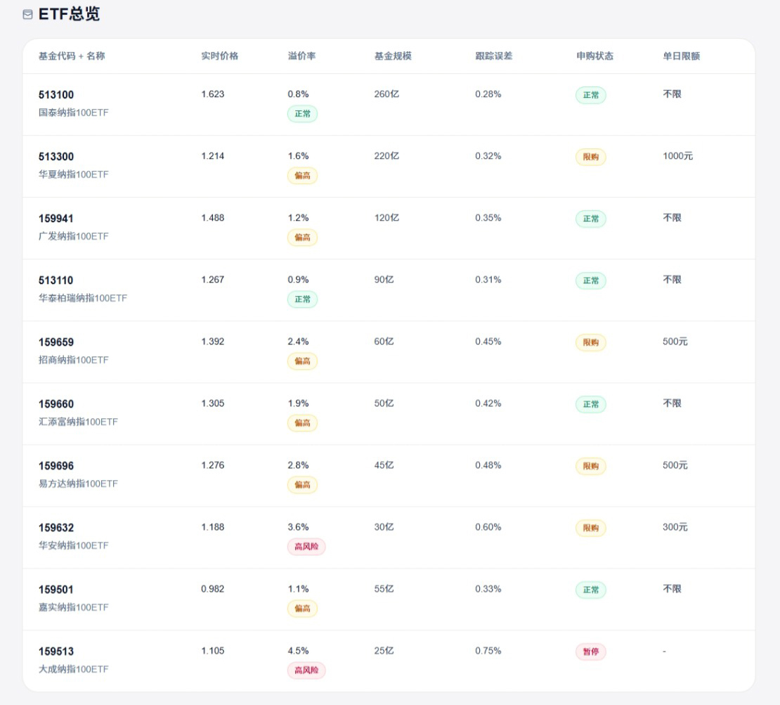
Dimension 3 · Participation Cost (ETF Page)
Domestic ETF comparison from the perspective of premium rate, tracking error, assets, and subscription status, helping investors evaluate the real cost of participation.
Dimension 4 · Macro Context (Drivers & Interpretation Page)
Macro indicators such as VIX, U.S. Treasury yields, and the dollar index, combined with event interpretation, provide a broader decision context beyond price alone.
Core Modules
Daily Strategy Summary
A lightweight summary card was designed to quickly synthesize the day's market context into an easy-to-read observation, helping users move from raw data to interpretation more naturally.

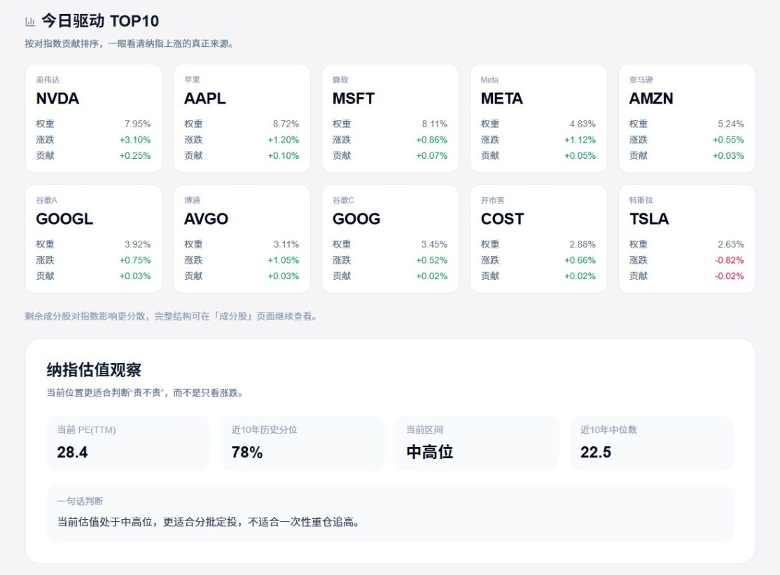
Index Drivers & Valuation Matrix
The dashboard organizes key companies, performance contribution, valuation status, and selected driver metrics together, so users can understand the internal condition of the index rather than treating it as a single number.
ETF Cost Comparison
A structured ETF comparison table helps Chinese investors compare multiple Nasdaq-related ETF products more rationally through premium rate, tracking deviation, scale, and trading convenience.
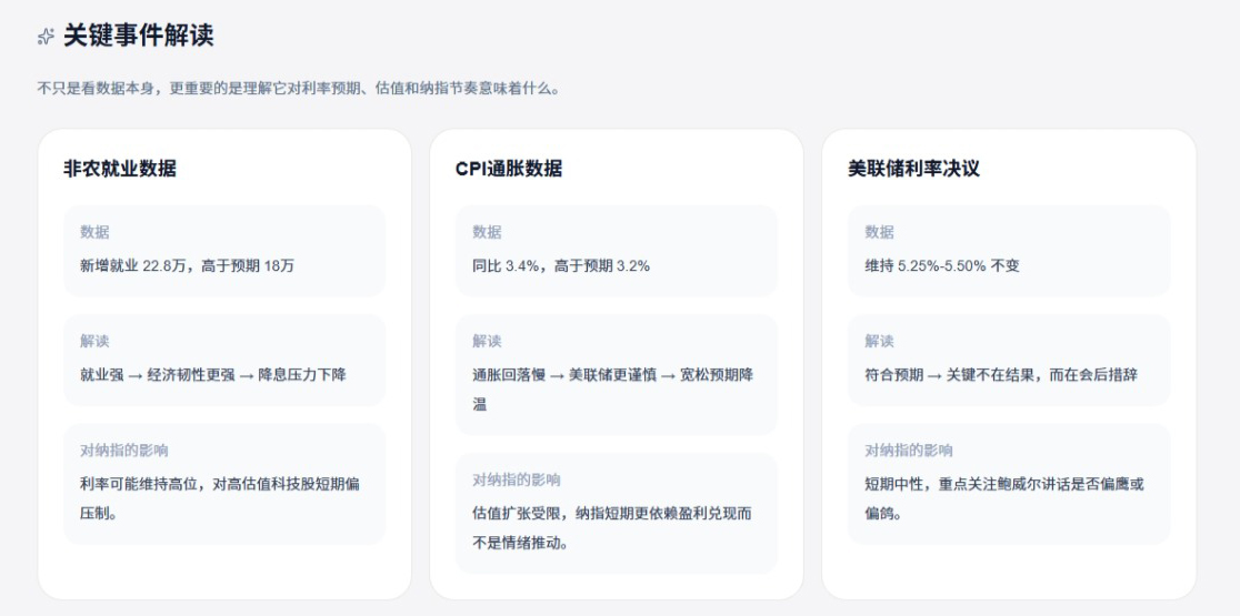
Event Interpretation Signals
Instead of listing macro events as isolated headlines, the product turns them into structured interpretation signals, linking major events to possible market implications and helping users build contextual judgment.
Design Decisions
Three key design decisions shaped this product into a focused information tool rather than a generic financial dashboard.
1 · Single-focus information architecture
The product was intentionally scoped around a single target: the Nasdaq-100. This avoided the common trap of becoming a broad but shallow finance portal.
2 · Easy layer switch with a clear user journey
The information was arranged from “what is happening now” to “how can I participate” and finally to “what macro context matters,” creating a natural reading flow.
3 · Context awareness for long-term investors
The product was not designed for short-term trading signals. Instead, it helps long-term investors observe valuation, structure, and risk context more clearly before making decisions.
Technical Implementation
The site was built with Next.js and Tailwind CSS, allowing the product to stay lightweight, structured, and easy to iterate. Static content and UI modules were organized to support fast visual refinement and future data integration.
The implementation focused on product clarity and communication value, making it suitable both as a public-facing information product and as a case study demonstrating structured information design.
Reflection
This project was an exploration of how an investment product can be designed as an information system rather than just a quote interface.
Traditional finance tools often overload users with fragmented metrics. This project showed me that a better investor product is not necessarily the one with more data, but the one that arranges information into a clearer reasoning path.
The real design value lies in helping users interpret complexity, reduce noise, and form more stable long-term judgment.